
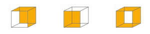
If we let our eyes settle on the cube and stare at one of the lines or corners, we can see the cube moving in different orientations. To see the change in orientation, we can also turn our eyes around the image, rather than starring, switch between our front and side visions and shift our “attention” from one side of the cube to another. We can start to see the cube standing up, faced down or to the sides. We can also see a closed cube, an open cube, a 3-sided cube and so on. The cube can also be seen as a 2-D object with no depth or illusional movement.
The perceptual reversals are almost as if we see an automatic slideshow of all the possible orientations of the cube, one direction at a time and in no particular order. However, while we might go through multiple visual experiences, the retinal image stays consistent. It’s still a cube.
What makes the cube ambiguous has been up for debate for years. The cube inflicts a perceptual instability as we experience the cube’s many orientations and directions. When we shift our attention from one side to another side of the image, we change perspective and thus experience the cube as we would other objects in real-life 3D. It has also been debated that the perceptual intervals result from our own judgment and mental and visual manipulations rather than a change in our visual perspective. Or perhaps it could be a combination of both!
visual cortex + brain preference
The Necker cube brings forward another powerful aspect of our perceptual manipulations and the role of the visual cortex. As our previous Article explained, one of our basic defense mechanisms is our ability to keep a consistent image of our surroundings, even if we don’t have all the details. Our brain assesses the new information received against the previously registered events to perceptually group information to create a familiar and a whole image of what we see in front of us (negative/positive spaces). So while the cube’s orientation might change, our brain arrives at a consistent interpretation of the image, the cube itself.
Where we look matters. What we perceive when we look at the cube changes based on where we’re looking at. And it seems our brain has a role in making this decision. We often see objects from above rather than below; so, our brain gives preference to the orientation (above) that is the easiest to put a whole image together.

personality traits
Much research has been done to study the stimulus of the Necker cube and the observer’s personality. These theories have focused on the introvert/extrovert personalities and the changes in perception of the cube, the number of orientations the observer perceives in a given time, and even the cube’s perceived size. The initial hypothesis of one of the tests by Dr. Peter Naish tested that “extraverts would see the cube flip more times when asked than introverts, but introverts would see it flip more when asked to just passively view it than extraverts.”
While there are debates and contradicting theories and hypotheses to these studies, they highlight an essential subject in design, the introvert/extrovert personalities and how they perceive the same design differently. We will study this interesting subject in more detail in the following article on bluebeige designs.
“Motivation drives orientation. An individual can be in the same situation at different times, but experience it differently and therefore behave in it differently. ” Michael Apter
subscribe to our newsletter
")
my name is aidin belganeh and i am the founder and chief creative director at bluebeige designs. i graduated with a bba degree in marketing from southern methodist university in 2012. while working in creative marketing and ux design, i realized my passion for architecture and design. i then enrolled at new york school of interior design, nysid, to pursue a career in interior design.
i started bluebeige designs shortly after. bluebeige designs is a design studio focusing on creating beauty through simple plain spaces. bluebeige designs magazine is an extension of our brand to explore interesting topics through the lens of architecture and psychology. our articles are in scholarly writing to explore the connections between science, art, design and architecture.
our articles put a spotlight on topics that can help us understand the world around us or change the way we see or perceive it. each article is carefully curated and referenced through data-based research and studies.
0 Comments