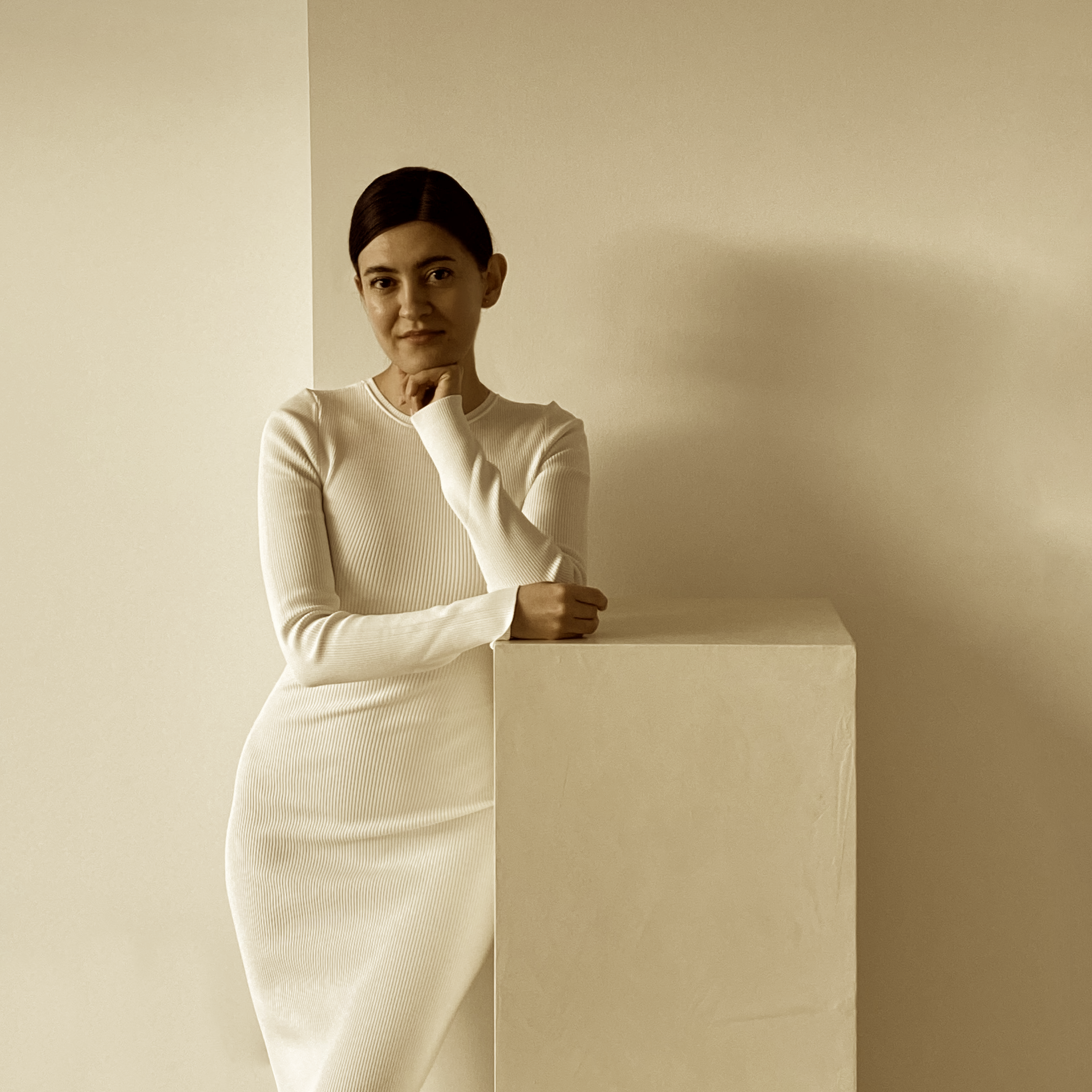
In terms of Spectral Colors, White and Black are not colors; however, White is arguably considered a color with no associated hue, an achromatic color. Then, White is described as all colors of the visible light (white light) with no designated color family (hue). So in technicality, White is a color but in visual perception, White means a lack of color.
White: Cultural & Emotional Associations
Colors don’t have a direct cause/effect relationship with how we feel, but rather there is a conditioning association between colors and our emotions. However, colors don’t directly impact our physical state of being, mood and even emotions.
For example, color Blue does not necessarily make us feel calm, and color Red does not suddenly make us feel passionate. Instead, our feelings are associated with colors through repeated linking and associations constructed by cultural and social references. Repeated linking of a color with an abstract idea conditions the brain to associate the color with that concept. These associations can be positive or negative and contradict each other across different cultures, leading to unique social and cultural bias and symbolism of colors. Colors carry symbolic messages that, with repetitive associations, become a part of our perceptions, feelings and emotions.

Some feelings about the color White come from natural associations of the color with our surroundings. For example, snow is white and pure, so we may associate White with purity and cleanliness.
Other associations are cultural symbolisms. In Western culture, we often associate the color White with simplicity, minimalism and innocence. In Japan, White represents inexperience, while White is a symbol of death and mourning in China. All colors, including White, are perceived through interactions of visible light and objects, and each color carries intangible weights of cultural and social obligations and symbolism.
white in design
Color is considered a non-characteristic physical property of an object; however, as discussed above, the feelings we associate with colors can often become an element of the object’s character. In theory, color does not change an object’s shape; however, as we learned in the article Colors & Visual Effects, colors can significantly manipulate or miscommunicate an object, including its shape and size. Using concepts like Color Constancy, Similarity, Association and our brain’s natural memory and encoding process, a designer can convey a strong emotional response in a color-free environment. The lack of chromatic colors in an architectural space indirectly triggers color analysis and concept associations.
In a color-free environment, objects don’t clash with their surroundings. A chromatic color palette highlights the contrast between the positive and negative spaces while a lack of color creates a transparent harmony of all forms and shapes in the space where “the whole is something besides the parts”. The color-free space creates a cohesive experience while objects and forms in a chromatic color palette compete against each other to create a one-against-all architectural culture.

The color-free palette allows us to first experience the space’s silhouette and the blankness. The lack of color heightens our other sensory organs, resulting in stronger and deeper memory recalling and associations. As the experience develops, all the space elements and the newly processed information are contrasted against previously registered information, events and concepts. These altogether shape the viewer’s emotional response to the space. In this experience, the viewer’s emotional response is developed in its own right as the viewer chooses what to feel and how to perceive the space.

The more we add to a story, the less there is room for imagination. The more layers of a design we remove, the less there is to interfere, and so, the more authentic and deeper the experience of the design becomes. The absence of color makes us more attentive to everything else because the exterior environment is silent. We see more and we feel more. It is no longer about the design we see but the experience we gain. This approach to design focuses on the sum of negative and positive spaces rather than each of them alone.
Perhaps, we may think White means the lack of color, lack of clutter and lack of imagination. White does not remove clutter but rather it opens room.
subscribe to our newsletter

my name is aidin belganeh and i am the founder and chief creative director at bluebeige designs. i graduated with a bba degree in marketing from southern methodist university in 2012. while working in creative marketing and ux design, i realized my passion for architecture and design. i then enrolled at new york school of interior design, nysid, to pursue a career in interior design.
i started bluebeige designs shortly after. bluebeige designs is a design studio focusing on creating beauty through simple plain spaces. bluebeige designs magazine is an extension of our brand to explore interesting topics through the lens of architecture and psychology. our articles are in scholarly writing to explore the connections between science, art, design and architecture.
our articles put a spotlight on topics that can help us understand the world around us or change the way we see or perceive it. each article is carefully curated and referenced through data-based research and studies.
0 Comments